Saturday, December 7, 2013

Carrier Pigeon Show in Chelsea (NYC)


My work is in a group show at the EMOA Space in Chelsea on 530 w. 25th street, NYC. Please stop by if you are in the NY area. It's a great show featuring the talented artists who have contributed to Carrier Pigeon Magazine. The show runs until December 14, 2013.

Monday, November 4, 2013

Etching Show at the National Arts Club in NYC

I am honored to have been asked to participate in the New York Society of Etchers Directors show which is being exhibited this week at the National Arts Club at 15 Gramercy Park South in NYC. The opening reception for the show is on Wednesday, November 6 from 6:30-8:30 pm. This is a really strong show and runs from November 3 until November 8—this week only.

The show will later travel to Chicago as work from the Chicago Printmakers Collaborative is also represented in the exhibition this week.

Sunday, November 3, 2013

New Linocut for a Cause

Limited Edition T-Shirt Available for purchase at portchesterdogpark.com.
My sister is raising funds to bring a much-needed dog park to her town of Port Chester. I had originally created a logo for her group (shown below) which was silkscreened onto t-shirts and made available for sale at all Port Chester Dog Park (PCDP) fundraising events, but we needed something a little more. There was a special event at Garcia's at the Capitol Theater and she needed some special edition shirts to offer for sale at the event. So I thought, why not try to print a linocut plate onto the shirts and make them into wearable art? The above image is the result of that experimental effort.

Though I had never done it before, I figured that since oil-based printing ink is very tenacious and never wants to come off your clothes, I could use it to print tees. This notion was born from the many printing "smocks" I have as a result of the ink-clings-to-everything principle. So, my sister got the shirts and I carved the linoleum and we were set to go when life's ups and downs took a big nosedive in the week leading up to the benefit at Garcia's. It was a very rough week but at least the printing went pretty smoothly as I inked the plate and ran the shirts through my etching press. Drying time took longer than expected due to a combination of the weather being pretty cold and damp and the shirt fabric not letting the ink soak in as much as on the test shirts (old, worn tees) which dried faster. But, thanks to a tip from a printmaking artist friend, Ilse, I was able to iron the print using newsprint and a very hot iron which made drying time a lot faster. Note: this technique does lift some of the ink away.

If you have any interest in getting one of these shirts and helping to fund the Port Chester Dog Park, please go to their website: http://portchesterdogpark.com/ or their fundraising page.

The logo shirts are for sale too:

Wednesday, October 23, 2013

Prints and Drawings at Mehu

My work will be in a group show, at the Mehu Gallery in NYC. The opening is on Thursday, October 24 from 6 until 9 pm. The show was curated by Bruce Waldman and Patricia Wynne.

Saturday, July 6, 2013

Animalia Print Exchange

© 2012, Elana Goren
Car Number 29
Reductive Linocut
©2012, Elana Goren

The above print was submitted for a print exchange organized by Printmaking Sisters in Australia. The Animalia International Print Exchange will be exhibited in Australia in August, then Italy and the U.S. in 2014.

I decided to do a linocut because I hadn't done one in a while and I wanted to create the print as quickly as possible with the deadline approaching and the need for extra time to ship the prints to Australia from New York.

I have been working for a while with the subject of cattle trucks that I see on the highway. They contain animals who are not fed or given water for the duration of the trip which might last days. I am pretty obsessed with the subject since I saw a calf one hot summer day in one of these death mobiles.

I was behind such a truck on an extremely hot day while driving on Interstate 84 that runs through New York. I saw a calf try to stick it's nose through one of the container's holes and stick his tongue out, desperately trying to get relief from thirst by "licking" the air rushing by the truck. It made me sick to think of those poor desperate animals, cruelly neglected as they were sped off to their deaths.

Friday, July 5, 2013

Working on a New Website

I know that it's been a long while since I posted but things have been very busy in "Spider Ink Land." I am looking at blogging options for my new website and since I can't seem to find a way to embed Blogger into the new website, I have to look elsewhere (unless any of you have a trick that I don't know about). I may need to use WordPress or some other (easier) blogging software to do what I need to.

I will post here to let you know when I have the new website up and the new blog up and running. Until then, I hope to add one or two more printmaking-relevant posts until the major switchover.

Hope the hot summer days have been treating you well. Stay cool and happy creating.

Thursday, April 4, 2013

Inspiration: Käthe Kollwitz

Käthe Kollwitz, Lithograph, Tod (Death), 1897
Käthe Kollwitz, Etching, After the Battle (Schlachtfeld), 1907
I recently took a stone lithography class with Devraj Dakoji at the Robert Blackburn Printmaking Workshop (RBPMW) and he has been (patiently) helping me print my stone from that class. I am very much a novice lithographer but I have been so inspired by the work of Käthe Kollwitz that I knew her work would act as a guide as I put litho crayon to stone.

Kollwitz's masterful use of shadow and light to evoke emotional responses to the plight of the people she depicts is as visually powerful today as it was over a hundred years ago. Her artistic subjects were derived from her world, what was going on around her: war, famine, disease and the gut-wrenching sorrow seen in the human condition during very difficult times.

I admire everything about Kollwitz's work: her ability to expertly render her subjects with empathy combined with a skillful hand, her expertise as a printmaker using the medium to maximize the dramatic and visceral reaction intended for the viewer, and her devotion to relaying the wrongs that she felt compelled to reveal through her art.

The two works above are a couple of my favorite pieces of Kollwitz's, especially the poignant etching, After the Battle, which by showing very little through use of a bit of light, speaks volumes about the poor woman on the battlefield searching for her loved one. I get chills and endless inspiration from this piece. Kollowitz's lithograph, Death, was my launching point for what I was trying to achieve with my own lithograph, The Road, shown below. I debated even showing my novice attempt at lithography but I thought it might be more relevant to a post about inspiration if I showed what the inspiration lead to.
So here is my humble and first lithographic homage to Käthe Kollwitz:

© 2013 Elana Goren
Lithograph, The Road


Monday, March 11, 2013

University of Wisconsin-Not In Our Name

Vivisection Victims, ©2009 Elana Goren
Aquatint Etching
One of my etchings was used in an article about horrible experiments being done at the University of Wisconsin. Here's the link to the article and a call-to-action: Maternal Deprivation at UW-Madison Today.

Saturday, January 12, 2013

Watercolor Monotype - Further Discussion

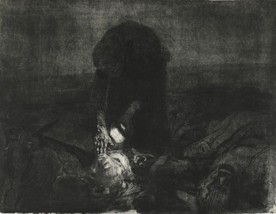
Small detail: And Then There Were None, watercolor monotype ©2012 Elana Goren
I had a request from a blog visitor to elaborate on my previous post, "Expressive Watercolor," where I had mentioned how we experiment with ground pigments in my watercolor monotype class. This post will address that request and hopefully give you a bit more insight into my method of working in this medium.* Jump to the paragraph with the asterisk if you want to skip the preliminary background discussion. Also, fyi, I have previously posted some preliminary discussions on watercolor monotypes here and here.

Firstly, a little background on monotypes. Impressionists from Degas to Cassatt embraced this way of creating unique prints. It traditionally involves applying oil-based colors such as printmaking inks to flat, smooth plates made of metal or plexiglass. The ink is applied or removed from the plate to create an image that is then transfered to paper using an etching press. This creates a unique print and sometimes a second (or ghost) print is made by putting the plate through the press again with a fresh sheet of paper. The first print will always differ from the second, with the former resulting in a stronger, brighter version of the latter.

Yet, there is also a more contemporary version of this versatile technique, watercolor monotypes, which require water-based or water-reactive media instead of the traditional oil-based inks or paints. I have to confess that I don't know the history of this newer approach, but I expect it was born out of the desire to create prints without the need for toxic solvents which are used for clean-up with oil-based media.

There are companies such as Akua and Createx that produce water-based inks that are designed for non-toxic monotype methods and I discuss these mediums in my class. However, I have found these colors to be more flat and much less luminous than what watercolor can yield and so I am more drawn to watercolor for that reason.

I use regular tube watercolors as well as Dr. Martin's Hydrus Watercolors (I love them for their intensity and vibrancy) but should not be confused with Dr. Martin's Dyes which are not archival. Painting on a plate with watercolor is pretty straightforward. The plate does need to be coated and buffed with gum arabic before you can get started but that prep work takes less than 5 minutes to do and the gum arabic dries almost immediately. After you've painted the plate and are finished with your image, you must let it dry completely before running the plate through the etching press with dampened paper.

*Ok, I've talked alot about monotypes and watercolor monotypes but I haven't talked about how I use these pigments yet, so here it is:

The more challenging part of my process when creating watercolor monotypes is when I introduce ground pigments into the work. And though I'm writing about my experiences with it here, I need to say that my experimentation with pigments is still ongoing. Dry pigments aren't the easiest or most predictable to work with, so if you have a precise idea in mind of what your results should be while using them, I suspect that you will be disappointed. Pigments (and printmaking in general) often require an open mind and a willingness to let things happen as they will when you work with the medium.

I use Earth Pigments and their website has alot of helpful recipes for all different applications, so I encourage you to check the recipes out (note: I am not affiliated with the company in any way, I just use their pigments). Keep in mind though, using these pigments is tricky since you need to prepare them properly in order to use them in your monotype work. Each pigment has different properties and some mix well with each other and some don't. You need to experiment with the colors and see how each pigment reacts. I mix a drop of glycerine and about a tablespoon of prepared gum arabic with anywhere from a pinch to a teaspoon of pigment (depending on how rich and opaque you want your color to be and the nature of the pigment) and mix all that with water (again amount of water determines strength or weakness of color—I suggest you add a little at a time and test it until you have what you want). I find that the glycerine helps distribute and smooth the color and the gum arabic acts as the binder. But you have to keep in mind the delicate balance you are working towards: too much glycerine makes it too "juicy" and "mushy" and too much pigment can cause dry areas that won't release to the paper when put the plate through the press. Some pigments also tend to be drier or need more binders, so you'll have to adjust accordingly. And, you cannot just mix the pigment powder with plain water and expect to create a dye/color/ink that can be used. This, my friends, will not work.

Once I have pigment prepared the way I would like, I tend to spray, drizzle, splatter or pour the pigment mixture onto my image to add energy and movement to what I've got down on the plate. This doesn't always work out as I had hoped since sometimes I miscalculate my mixture and end up with a mush if the color has pooled in one area or again if too much glycerine was used. It's usually best to use the pigment mixture sparingly at first to get a feel for it's properties and how it fits in with the way you work. You can also mix the pigments with your wet watercolor paints which is what I do all the time.

I hope this rather lengthy post has been helpful and as always please don't hesitate to leave a comment or suggestion. I always welcome your feedback.