Showing posts with label Printmaking. Show all posts

Tuesday, February 20, 2018

Solo Show opening in March in Beacon


Solo show, Prints and Ghosts, from March 10–April 8 at Theo Ganz Studio in Beacon. The opening reception will be on March 10 from 6–8 PM.

This exhibition will feature mixed-media monotype explorations of animals. The show includes an exciting new series which deals with variations on single themes and how they both relate to and diverge from one another.

Many of the prints were created using similar watercolor monotype techniques described on this blog here.

Saturday, March 18, 2017

Monoprint, Monotype, Strappo E-Zine

MM&S E-Zine
My work was included in the latest issue of MM&S e-zine along with some truly great printmakers. I feel privileged to have work in the same publication as these talented artists. 

Friday, March 20, 2015

White Ground Plate/Print Comparison

Left: zinc etching plate with white ground applied.
Right: etching print, 1st state.
Jacob Sheep
, etching © 2015, Elana Goren.
I have reviewed white ground etching techniques previously here and here. You should be able to get a good idea of the white ground process from the these links (previous posts), especially the first one.

I am always fascinated with the way a plate looks when prepared for etching versus the actual etching print from the same etched plate. This especially holds true for white ground etching techniques since the white ground mimics the white areas of the final print and more clearly resembles the actual light to dark areas in the image than other etching techniques do. This is because the thicker the white ground is on the plate, the whiter that area will be since the acid has more difficulty reaching the plate in those thicker areas. The acid discriminately etches the plate depending on how thick the white ground coverage is on any particular place on the plate. So, in the thinner areas, you see less white on the plate (a darker tone within the ground coverage) and the acid has a better chance to reach the plate for the etch.

The interesting thing is that as much as you can know that thicker is whiter and thinner is darker, you can never really know how the plate will etch, and surprises reveal themselves all the time. There will be areas that seem well protected and will therefore be lighter and other areas that seem less protected and should be darker. But as said before, surprises abound.

When I worked on the plate pictured above, I expected the sheep in the background as well as the area around it in the deep background to be darker than they actually turned out to be. The foreground sheep's darker areas (especially in the face) served up some unexpected lighter areas as were also seen on it's back.

After I took the photo of the 1st state of the etching (print seen above), I decided to go back and etch the plate again to tone back the background more. I used a combination of white ground and hard ground, since the former better blends with the similar effects from the 1st state and latter completely protects the areas that I don't want to be etched at all. The result (2nd state) is seen below. I still want to darken the background areas further. So I will either try to achieve it that while inking the plate and leaving more ink in the darker areas (wiping less there) or I will go back for a third state etch and try to get desired results that way.
Jacob Sheep, white ground etching, 2nd State.
© 2015, Elana Goren.

Saturday, July 6, 2013

Animalia Print Exchange

© 2012, Elana Goren
Car Number 29
Reductive Linocut
©2012, Elana Goren

The above print was submitted for a print exchange organized by Printmaking Sisters in Australia. The Animalia International Print Exchange will be exhibited in Australia in August, then Italy and the U.S. in 2014.

I decided to do a linocut because I hadn't done one in a while and I wanted to create the print as quickly as possible with the deadline approaching and the need for extra time to ship the prints to Australia from New York.

I have been working for a while with the subject of cattle trucks that I see on the highway. They contain animals who are not fed or given water for the duration of the trip which might last days. I am pretty obsessed with the subject since I saw a calf one hot summer day in one of these death mobiles.

I was behind such a truck on an extremely hot day while driving on Interstate 84 that runs through New York. I saw a calf try to stick it's nose through one of the container's holes and stick his tongue out, desperately trying to get relief from thirst by "licking" the air rushing by the truck. It made me sick to think of those poor desperate animals, cruelly neglected as they were sped off to their deaths.

Thursday, April 4, 2013

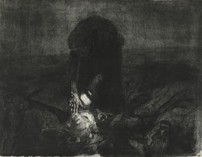
Inspiration: Käthe Kollwitz

Käthe Kollwitz, Lithograph, Tod (Death), 1897
Käthe Kollwitz, Etching, After the Battle (Schlachtfeld), 1907
I recently took a stone lithography class with Devraj Dakoji at the Robert Blackburn Printmaking Workshop (RBPMW) and he has been (patiently) helping me print my stone from that class. I am very much a novice lithographer but I have been so inspired by the work of Käthe Kollwitz that I knew her work would act as a guide as I put litho crayon to stone.

Kollwitz's masterful use of shadow and light to evoke emotional responses to the plight of the people she depicts is as visually powerful today as it was over a hundred years ago. Her artistic subjects were derived from her world, what was going on around her: war, famine, disease and the gut-wrenching sorrow seen in the human condition during very difficult times.

I admire everything about Kollwitz's work: her ability to expertly render her subjects with empathy combined with a skillful hand, her expertise as a printmaker using the medium to maximize the dramatic and visceral reaction intended for the viewer, and her devotion to relaying the wrongs that she felt compelled to reveal through her art.

The two works above are a couple of my favorite pieces of Kollwitz's, especially the poignant etching, After the Battle, which by showing very little through use of a bit of light, speaks volumes about the poor woman on the battlefield searching for her loved one. I get chills and endless inspiration from this piece. Kollowitz's lithograph, Death, was my launching point for what I was trying to achieve with my own lithograph, The Road, shown below. I debated even showing my novice attempt at lithography but I thought it might be more relevant to a post about inspiration if I showed what the inspiration lead to.
So here is my humble and first lithographic homage to Käthe Kollwitz:

© 2013 Elana Goren
Lithograph, The Road


Saturday, January 12, 2013

Watercolor Monotype - Further Discussion

Small detail: And Then There Were None, watercolor monotype ©2012 Elana Goren
I had a request from a blog visitor to elaborate on my previous post, "Expressive Watercolor," where I had mentioned how we experiment with ground pigments in my watercolor monotype class. This post will address that request and hopefully give you a bit more insight into my method of working in this medium.* Jump to the paragraph with the asterisk if you want to skip the preliminary background discussion. Also, fyi, I have previously posted some preliminary discussions on watercolor monotypes here and here.

Firstly, a little background on monotypes. Impressionists from Degas to Cassatt embraced this way of creating unique prints. It traditionally involves applying oil-based colors such as printmaking inks to flat, smooth plates made of metal or plexiglass. The ink is applied or removed from the plate to create an image that is then transfered to paper using an etching press. This creates a unique print and sometimes a second (or ghost) print is made by putting the plate through the press again with a fresh sheet of paper. The first print will always differ from the second, with the former resulting in a stronger, brighter version of the latter.

Yet, there is also a more contemporary version of this versatile technique, watercolor monotypes, which require water-based or water-reactive media instead of the traditional oil-based inks or paints. I have to confess that I don't know the history of this newer approach, but I expect it was born out of the desire to create prints without the need for toxic solvents which are used for clean-up with oil-based media.

There are companies such as Akua and Createx that produce water-based inks that are designed for non-toxic monotype methods and I discuss these mediums in my class. However, I have found these colors to be more flat and much less luminous than what watercolor can yield and so I am more drawn to watercolor for that reason.

I use regular tube watercolors as well as Dr. Martin's Hydrus Watercolors (I love them for their intensity and vibrancy) but should not be confused with Dr. Martin's Dyes which are not archival. Painting on a plate with watercolor is pretty straightforward. The plate does need to be coated and buffed with gum arabic before you can get started but that prep work takes less than 5 minutes to do and the gum arabic dries almost immediately. After you've painted the plate and are finished with your image, you must let it dry completely before running the plate through the etching press with dampened paper.

*Ok, I've talked alot about monotypes and watercolor monotypes but I haven't talked about how I use these pigments yet, so here it is:

The more challenging part of my process when creating watercolor monotypes is when I introduce ground pigments into the work. And though I'm writing about my experiences with it here, I need to say that my experimentation with pigments is still ongoing. Dry pigments aren't the easiest or most predictable to work with, so if you have a precise idea in mind of what your results should be while using them, I suspect that you will be disappointed. Pigments (and printmaking in general) often require an open mind and a willingness to let things happen as they will when you work with the medium.

I use Earth Pigments and their website has alot of helpful recipes for all different applications, so I encourage you to check the recipes out (note: I am not affiliated with the company in any way, I just use their pigments). Keep in mind though, using these pigments is tricky since you need to prepare them properly in order to use them in your monotype work. Each pigment has different properties and some mix well with each other and some don't. You need to experiment with the colors and see how each pigment reacts. I mix a drop of glycerine and about a tablespoon of prepared gum arabic with anywhere from a pinch to a teaspoon of pigment (depending on how rich and opaque you want your color to be and the nature of the pigment) and mix all that with water (again amount of water determines strength or weakness of color—I suggest you add a little at a time and test it until you have what you want). I find that the glycerine helps distribute and smooth the color and the gum arabic acts as the binder. But you have to keep in mind the delicate balance you are working towards: too much glycerine makes it too "juicy" and "mushy" and too much pigment can cause dry areas that won't release to the paper when put the plate through the press. Some pigments also tend to be drier or need more binders, so you'll have to adjust accordingly. And, you cannot just mix the pigment powder with plain water and expect to create a dye/color/ink that can be used. This, my friends, will not work.

Once I have pigment prepared the way I would like, I tend to spray, drizzle, splatter or pour the pigment mixture onto my image to add energy and movement to what I've got down on the plate. This doesn't always work out as I had hoped since sometimes I miscalculate my mixture and end up with a mush if the color has pooled in one area or again if too much glycerine was used. It's usually best to use the pigment mixture sparingly at first to get a feel for it's properties and how it fits in with the way you work. You can also mix the pigments with your wet watercolor paints which is what I do all the time.

I hope this rather lengthy post has been helpful and as always please don't hesitate to leave a comment or suggestion. I always welcome your feedback.


Wednesday, December 19, 2012

The Technique Example vs. the Portfolio Piece

Pretense
Watercolor Monotype example
Recently I was faced with a perplexing decision. Do I put my very large and imposing portfolio piece in a group show meant to show teachers' (my) work along with students' work? Or, do I show less strong, smaller pieces intended mostly to show what is possible with the class technique that I have been showing to my students? Which is better to attract new students to a generally unfamiliar printmaking technique?

Rift
Watercolor Monotype example
The class I teach is Watercolor Monotype which differs considerably from traditional monotype in both technique and the look and feel of the final print. Though my more accomplished piece does exhibit the qualities of watercolor monotypes, I felt it didn't show a wide enough range of techniques that this versatile medium offers. I also didn't want to overshadow my students' work which was much, much smaller in comparison. So I opted to show a couple of small pieces that for all intents and purposes did not reflect my current work very much but were merely examples of what could be done. That is what is shown here. Any thoughts?

I am not sure if the decision was the right one but it is an interesting dilemma to face as a teaching artist who is trying to attract students to a new medium.

Saturday, November 24, 2012

Today is Toulouse-Lautrec's birthday

Jardin de Paris, May Belfort, 1883
Henri De Toulouse-Lautrec
Lithograph
I probably don't need to write this as it is probably not news to anyone but Henri de Toulouse-Lautrec was one of the greatest lithographers of all time. He fully embraced this printmaking medium and maximized its potential for illustration and poster design. He was among the artists who took the relatively new printmaking medium of lithography (in the late 19th century) and became one of the world's most famous lithographers. His masterful use of simplified color fields and expressive, painterly line compositions are as powerful today as they were in the 1800s.

Late 19th Century/Early 20th Century Lithography Timeline
The timeline above (click to embiggen) is a slide I made in grad school for a presentation on the history of lithography. You can see that Toulouse-Lautrec has a prominent spot on this timeline and yet he was accompanied by many other talented poster artists who exploded on the lithography scene in Europe and the U.S. near the close of the 19th century. Jules Cheret, who invented the 3-color lithographic process, paved the way for the other artists listed here including Toulouse-Lautrec.

If you are of the mind to look them up, these other artists include: Pierre Bonnard, Théophile Steinlen, Maxfield Parrish, Leonetto Cappiello, The Beggarstaffs, Lucian Bernhard, Eugène Grasset, Edward Penfield, William H. Bradley, among others. And in the early 20th century, the work of printmaker, designer, illustrator, painter and typographer, Cassandre became well known as his iconic lithographic travel posters of grand ships and advertisements for Dubonnet were produced and subsequently distributed internationally. In fact, designers in the late 20th century to the present, continue to draw inspiration from Cassandre's work. See Paula Scher's Audiophile promotion for CBS Records in 1980. And compare it to Cassandre's seen below. This is just one example, and there are more current ones where designers and illustrators continue to draw inspiration from Cassandre as well as other early lithographers.
L’intransigeant, 1925
A.M. Cassandre
With that all said, Happy Birthday Henri!

Saturday, June 30, 2012

Chine Collé

I have been asked to describe chine collé and so I thought I'd share my explanation here. Basically, chine collé is a collage technique used by printmakers. Very thin Asian papers or tissue papers are often used to create color fields and textural effects within a print in such a way that the glued paper is seamlessly integrated with the inked image impression from the plate. It doesn't matter whether it is an etching, woodcut/linocut, lithograph or monotype plate, chine collé techniques can be used for each printmaking process.

It is a matter of preference which type of glue and technique is used for chine collé. I prefer methyl cellulose which I have seen used at the Robert Blackburn Printmaking Workshop (RBPMW) in NYC and that's where I learned the technique that I will describe here. 

There are many recipes for mixing methyl cellulose powder with water to create the paste, but it's tough to say which is best because it all depends on the needs of each project. You can find recipes online by searching for "Methyl Cellulose" and "Printmaking," but I've used a recipe that calls for 1 tablespoon of methyl cellulose powder to 1 cup of warm water. This is mixed and left to stand for a while while the mixture cures a bit.

The methyl cellulose mixture is applied with a foam brush (keeping all strokes going in the same direction) to a sheet of clean plexiglass and left to dry (about an hour). A second application of methyl cellulose is then applied to the plexiglass with perpendicular strokes to the first application. While this second application is wet, carefully lay the piece of paper intended for incorporation into your print onto the wet glue surface. Start with one end of the paper and carefully lay the paper in stages from one end to the other, smoothing air bubbles as the paper comes in contact with the glue. Let this dry overnight so that your paper will be ready for chine collé application when you are ready to print.

Once your plate has been inked and is ready to print, you can apply the glue-coated paper to it as long as the paper and it's glued surface are dry. Carefully peel the paper off of the plexiglass and lay it down, glue-side up, onto the plate in the place where you would like the paper effect to be in you final print. Keep in mind that the final printed image will be a flipped version of your plate and so when the chine collé paper is glue side up on the plate, this will also be a flipped version of the final print. Also keep in mind that the paper you are printing on needs to be moist in order to reactivate the glue for this type of chine collé technique to work as it is run through the press. 

I would like to note that there are alot of differing ways to apply paste to the paper and there are nicely documented alternate versions seen here and here. The first linked site shows wet glue applied to Japanese Gampi paper after it has been laid onto the plate. The second link has more step-by-step photos which include paste-making.

I hope to have some photos of an upcoming project to add to this post, but I thought at least I would offer an explanation now for those who are curious about what chine collé is and would like to try it.

Saturday, June 23, 2012

New Explorations in Etching

Detail: Through Humans' Scope
Aquatint Etching, ©2012, Elana Goren

Through Humans' Scope
Chin Colle Aquatint Etching, ©2012, Elana Goren

I had been experimenting with different ways to create explosive, violent images using aquatint etching techniques and this piece is a result of those explorations.

My goal was to use 12 to 16 plates (all 9" x 6") to print in a brick pattern on large (44" x 30") paper in order to create a kind of wall of explosive imagery that one could see from a distance. As the viewer came closer to the piece, images would emerge from the dark, splattered areas and the experience would be more complete.

Technically, the difficulty lay in inking and wiping that many plates at once and printing them with the hopes that there was enough consistency in the color tone and richness through all the images. I also needed to see that their arrangement would be visually balanced throughout the entire piece.                         

I started by printing them on Unryu paper which is very thin and has fibers in it that I hoped would add to the chaos of the imagery. I layed these prints out on top of the big sheet of Rives BFK to figure out my composition and get a sense of how the prints were all working together. During this process I realized that chin colle was the way to go as I saw the piece come together.

My description of Through Humans' Scope for an upcoming show is as follows:
Animals are simple caricatures in most humans’ minds, not existing in our reality unless they are being utilized for some selfish purpose or another. This concept was the driving force behind my etching piece, Through Humans’ Scope, where animals are depicted in outline form, almost not there, until their image crosses into the dark realm of violence and exploitation where they turn into actual flesh. The explosive, dark fields, almost reminiscent of gunshots, bring each of the twelve subjects into a more modeled and fleshed out version of themselves. Only through violence do they become real to humans.

Through Humans' Scope, can be seen at the Theo Ganz Gallery in Beacon, NY from July 14 until September 2, 2012.

UPDATE: This piece was mentioned in a NY Times article.

Saturday, November 26, 2011

Robert Blackburn Printmaking Workshop


I do most of my etching work at the wonderful Robert Blackburn Printmaking Workshop (RBPMW) on 39th street in NYC. The top photo is me at RBPMW working on one of my latest etchings. The photo underneath is also at RBPMW and shows a view of two of the Charles Brand presses, artist Beth Sutherland working on one of her etchings, and beyond her is the aquatint box and door to the acid room.

Over at Tom Cathey's blog he has a post about his visit to RBPMW which features shots of the workshop, including one of Beth's prints in the drying rack and a photo of me describing my process to botanical artist, Mindy Lighthipe and artist, Patricia Wynne. It was a pleasant surprise to see Mindy there as I hadn't seen her since my days at the botanical garden in 2003, training to become a botanical illustrator (a short-lived dream of mine back then).

Saturday, June 19, 2010

New Woodcut

"Sundown"
Woodcut
Plate size: 13 1/4" x 12"

I am attempting to expand my printmaking focus and create more woodcut prints. One reason is that I love the way the wood grain comes through on the print. I also find the act of carving the wood very therapeutic, almost meditative. The wood also guides me, helping me with the direction that I take the work and I love aspect of the creative partnership with the medium.

I try to find discarded scrap wood, if possible, so that I can try to minimize my impact on the trees used for plywood, etc. It's not always easy or practical to do this but I think it's worth the effort to find scrap when and where I can.

I find that my approach to carving the wood is similar to my approach to creating aquatint etchings where I tend to use multiple strokes to add depth to the image. With etchings, I use a brush with stopout (both asphaltum-based and acrylic-based) to create the varied layers of tints. And with woodcuts, it seems natural to me to make the same type of marks with my carving tools. I'm not sure if this is the best approach to use for wood since it lends itself to yielding more bold and graphic prints than does etching. Yet, it seems that my style leans more towards the subtle and a focus on detail (unless I'm working on monotypes), so this comes through on my woodcut work as well as with my etchings.

Sunday, May 23, 2010

Another in a series

"Lab Animal"
Plate size: 15" x 11 3/8"
 Monotype on Rives BFK

This is another monotype that is part of a series that I'm doing on primates used for vivisection in the labs. My work on these monoprints has been difficult in two ways. Firstly, and more poignantly, I have to work through the anger and disgust that I feel at the scientists who torture primates, sentient and sensitive cousins to our species. And secondly, I have work through my learning curve in creating monotypes. 

I can see that I am getting better at this as I work, but it does get frustrating when they don't all come out as well as I'd like. Hence, the previous post on what to do when faced with that particular challenge. You may also want to read the comment that Aime Roman made on my last post. She offers some good advice about other media to use besides pastels on monotypes. 

And by the way, kudos to Aime for making the list of 50 Incredibly Inspiring Printmaking Blogs!

Friday, April 30, 2010

How I Create Monotypes (usually)

 "Nowhere to Hide"
 Plate size: 10" x 8"
 Monotype on Rives BFK

Amie Roman let me know about great idea by Carol Nunan over at Horsley Printmakers. Carol has a post on her blog, Carol's Original Prints, asking printmakers to post their techniques for creating monotypes and monoprints. Amie has a great post about how she creates monoprints, please go check it out. Also, you should take a look at the work of Bruce Waldman who creates monotypes by drawing with the edge of his brayer (among other techniques). Bruce is an incredible artist and was the first one who taught me how to do monotypes. Amie had a great post about Bruce where he describes his way of working which you can see here.

So, in the spirit of sharing, here's my humble contribution:

I create monotypes using oil-based litho and/or etching inks. Oil-based inks give me alot of "open" time (several hours) in which to work into the ink before it dries. Using a brayer, I completely cover a plexiglass plate with ink until I achieve the density of color that I am looking for. I can moderate how opaque or transparent this ink layer is at this stage by controlling how much ink I apply to the plate. It helps to hold the plate up to the light to see how much ink coverage I have before I start creating my image. This is one of the advantages to using plexiglass for your monotype plate rather than metal or other opaque material.

Next, I use any number of tools to remove the ink from the plate. This process is referred to as the "reductive" method of creating a monotype. My tools include paper towels (made of recycled paper), cotton swabs, fabrics of different textures, brushes and anything else that I can find that will leave an interesting impression in the ink. But I'd say the tool I use most is a paper towel piece wrapped around the tip of my finger.

After I finish creating the image, I hold the plate up to the light since the plate is transparent and the light that comes through gives me a more accurate "read" on how the plate will ultimately print onto the paper. I see a big difference between the way the plate looks on the glass table I work on and when I hold it up to the light.

The final step is to create my print by running it through my etching press. I use pressure that is light enough to transfer the ink to the paper without mushing and spreading the ink and heavy enough to emboss the paper with the edge of the plate as with an etching.

As I've mentioned in previous posts here and here, I find this method of working addictive. I encourage anyone with an interest to get started as soon as possible. I predict you'll never want to stop.

Happy creating!

Tuesday, April 6, 2010

Monotype Addiction

"Scream"
Plate Size: 8" x 10"
Monotype

When I just want to get into my studio and work spontaneously I've been turning more and more to monotypes to get my creative juices flowing. I find the work addictive since it's such a fast and satisfying way to produce a print. It's also a way that I can quickly experiment with different ways to ink the plate and helps give me ideas for other printmaking media. 

I also find that I can be much more emotionally expressive with my monotypes. My work is based on an empathy with non-humans and I feel it's important for the personality and energy of the subject to come through. Monotypes are so much more spontaneous for me than painting and it's obviously much more in the moment than etching.

The above monotype is part of a series that I am working on about the plight of animals in zoos, circuses and laboratories.

Friday, January 22, 2010

New Etching


Typical Day at the Circus
plate size: 18" x 24"
aquatint etching on Rives BFK


This is one of the latest etchings I've done. It was a big plate and a bit more difficult to aquatint and get the tonality that I was trying to achieve in some areas but after a few etching states, I finally got the depth and atmospheric tone I was going for.

Thursday, January 14, 2010

Non-Toxic Etching


For all of you printmakers out there, I've been doing some research on non-toxic (or much less toxic) etching techniques that I can do in my studio without needing to install an exhaust system.

I came across NontoxicPrint.com and they outlined a way to etch zinc plates (which I use) without nitric acid and the toxic fumes it emits. You can actually etch zinc, aluminum and steel in a mixture of copper sulfate, table salt and water.

So, I decided to do a test and etch a small zinc plate (6" x 3") with a 50/50 mix of copper sulfate and regular table salt (not iodized). See print above. The solution was a small amount -- 1L hot water mixed with 200ml of the powder mixture (100ml copper sulfate and 100ml salt).  I used an old plate that had hard ground on it from a long time ago and didn't bother to reground the plate before I drew into it (hence the messiness of the lines and the bitten edges from old ground flaking off). I had no idea how much time would be needed so I sectioned the plate off into 15-minute increments except for the first 10 min section.

What's interesting is that copper sediment forms at the etched areas much the same as bubbles form when the plate's in nitric acid. So you need to brush off the sediment in the same way as the bubbles. I didn't brush anything off during the etch because I wanted to see what would happen. I did, however wipe off the sediment each time I took the plate out to cover a section for the next etch. And in doing so, I inadvertently removed some of the old hard ground so there are some foul bitten areas around the marks in some areas.

For the next test I'm going to use the acrylic, waterbased ground (Z-Acryl) and see how that holds up to this process. It looks like this process etches in about the same time as nitric acid and there are no harmful fumes in the air during etching. So an exhaust system isn't necessary and (yay) I can etch in my studio fume-free.  The solution is considered a marine pollutant as it is toxic to water wildlife and needs to be disposed of properly (NOT down the drain), yet according to NontoxicPrint.com:
The left over copper residues from the etching process are a valuable resource. You may well be able to find a local recycling firm that actually pays for your etching residues - a substantial part of these is solid copper. Or, with the addition of sodium bisulfate to the etching residue you may actually be able to reclaim the solution a number of times.
So, there you have it. No more need to handle deadly nitric acid when there's a much safer way to etch. And NontoxicPrint.com has recipes for solutions to etch copper and brass as well (amongst other non-toxic printmaking techniques).

UPDATE: I've updated the links for nontoxicprint.com since one wasn't working at all and the others didn't direct to the relevant page.

NOTE: There is a comment below from an anonymous commenter who explains a chemical reaction between copper-sulfate and salt. Since I have no chemistry background, I cannot verify whether or not this information is accurate. However, please note that there is always a risk involved in using and mixing chemicals that you are not familiar with. Please use caution and get as much information before-hand when using all etching methods whether they are considered traditional or "non-toxic." I find that nontoxicprint.com, Zea Mays, and others are good resources to look into for comprehensive information on non-toxic etching as well as other "greener" printmaking materials and techniques. 

Monday, December 28, 2009

New Monotypes


"Taken," plate size 6" x 9"


“Awaiting Their Fate," plate size 10" x 8"


"Dairy Cow II," plate size: 28” x  20”

I have been experimenting with monotypes and I find the process pretty addictive. I work on a plate from anywhere between 1 and 3 hours (depending on the size of the plate) and I get a unique print with qualities that I can't achieve any other way. Also, it's a such an enjoyable way to draw. I use mostly the subtractive method, utilizing things like paper towels and cotton swabs to remove ink from the plexiglass plate. This helps yield expressive strokes in the highlighted areas, adds textural qualities in shadowed areas and shows the drawing process with every streak and lightly inked area created with these soft, blunt tools. I can also manipulate the ink on the plate with my fingertips to form the shadowy figures that I tend to include in my compositions.

These monotypes have been a great break from the rigors of the intense and detailed work that goes into my etchings. And the satisfaction of pulling prints so quickly makes this a seductive way to work. I also plan to experiment with monoprints where I hope to combine the expressive effects of monotypes with the fine linear work of etchings. This is a yet another thing about printmaking that is so appealing: one technique leads to another and then to a combination of those processes and on to more discoveries down the road. Printmaking never fails to light up my mind with creative possibilities.

Wednesday, August 26, 2009

Eyes Void of Hope

I've been experimenting with textures in my aquatints and the results can be surprising and interesting. I used a burlap texture for this subject, a cow who spends her days with her head locked in bars that do not allow her to turn around, move very much at all. Her eyes are truly void of any hope, or light, or anything beyond her misery.

UPDATE: For a good article on the plight of farm animals in the U.S. look at this in The Atlantic.

Sunday, August 9, 2009

Ribbon-Cutting Ceremony with the Mayor


We had a great day at Brown Street Studios. The Mayor of Peekskill, Mary Foster, officiated the ribbon-cutting ceremony for our new building sign. The pic above is of John Ford (the building owner) and me cutting the ribbon. Mayor Foster is on the left and the people surrounding us are mostly the rest of the artists at Brown Street Studios.

After the ceremony, we invited everyone up for a tour of our studios and had the studios open to the public for the rest of the day. We had a steady flow of people come through and the day was very successful.

I spent most of Friday cleaning up my studio and so my husband, Rocky, decide to document "the clean" by taking pictures. This is about as clean as my studio has been in a long time: